hydréation
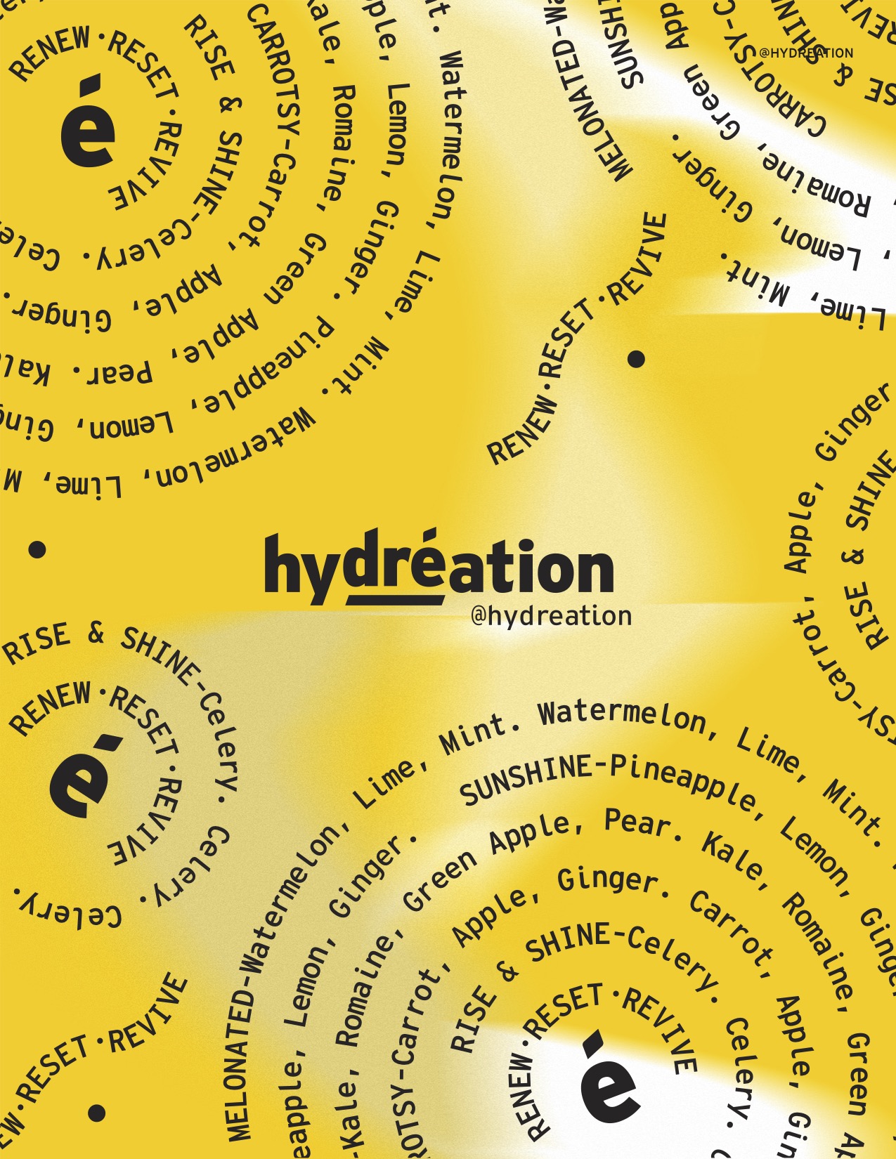
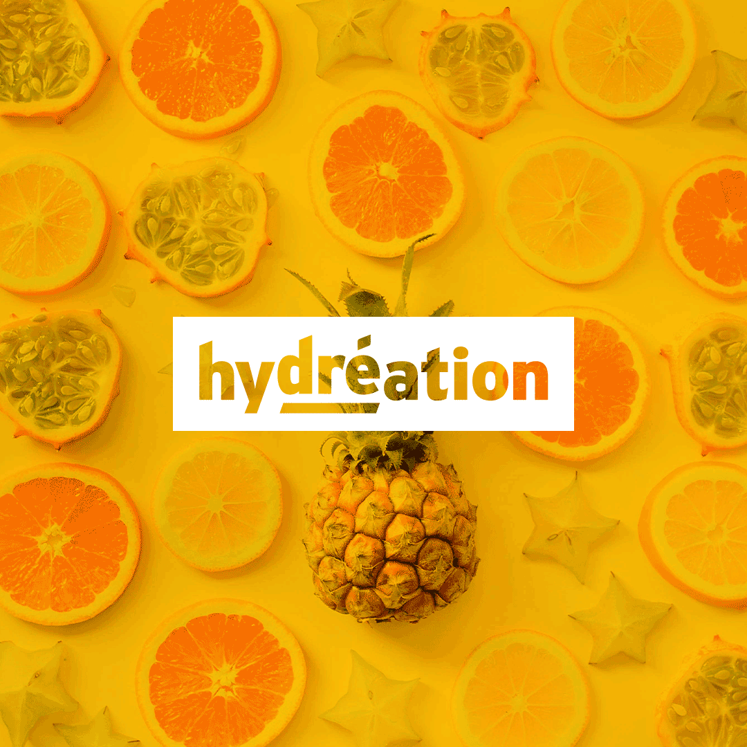
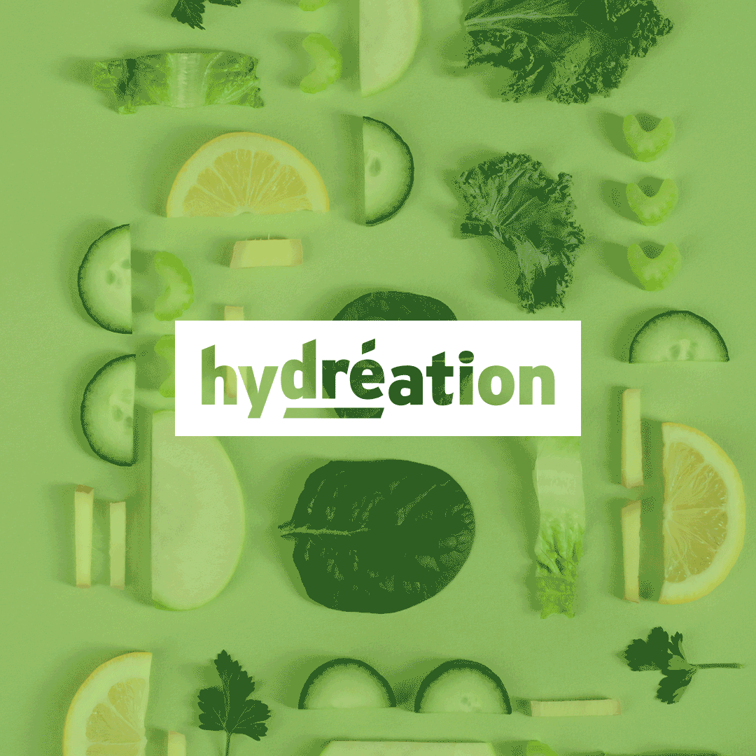
The creative approach for Hydréation goes beyond just being a cold-pressed juice brand—it’s a modern, conscious lifestyle movement. The visual identity blends contemporary aesthetics with an energetic, wellness-driven narrative, positioning the brand as a force for self-care that extends beyond the body to include mental clarity, emotional balance, and sustainability.
Hydréation:不只是果汁,而是一種生活方式
Hydréation 是一種態度 :時髦、能量滿滿、從裡到外的自我照顧。不只是補充營養,Hydréation 帶來更全面對身心靈的照料。品牌的視覺語言大膽、簡潔,配色鮮明,強調活力與純粹,傳遞著不只是果汁,而是一種選擇、一種日常儀式。

Design Philosophy
- Modern & Minimalist: The bold typography and high-contrast color palette exude confidence, clarity, and a fresh, forward-thinking spirit.
- Contemporary & Energetic: Asymmetrical layouts, dynamic compositions, and vibrant hues mirror the brand’s lively, health-focused mission.
- Self-Care Beyond the Body: The brand embraces holistic well-being, supporting not only physical health but also mindfulness, community, and environmental responsibility.
Beyond Just Juice
Hydréation is evolving into a comprehensive wellness brand, with future expansions into functional foods, holistic experiences, and sustainable lifestyle products. The branding must stay fluid and adaptable, allowing for collaborations, limited-edition collections, and immersive wellness events that reinforce the message: renew, reset, revive—not just for your body, but for your life.品牌核心概念
- 當代 & 直覺化設計:俐落的排版、強烈的字體、鮮明的色彩計畫,充滿能量的品牌形象,讓品牌不只是商業產品,而是能與人產生情感連結的存在。
- 從裡到外的照顧:Hydréation 談的不只是「健康飲食」,而是關於內外兼顧的自我照顧—從心理健康、生活節奏到環境意識,這是一種全新的健康哲學。
- 延展性的品牌未來:這不只是果汁,未來 Hydréation 將進入機能食品、身心靈保養、永續的生活方式,打造完整的健康社群。

Client | Hydréation
Creative Direction | Fairy Shih