VSCO Redesign
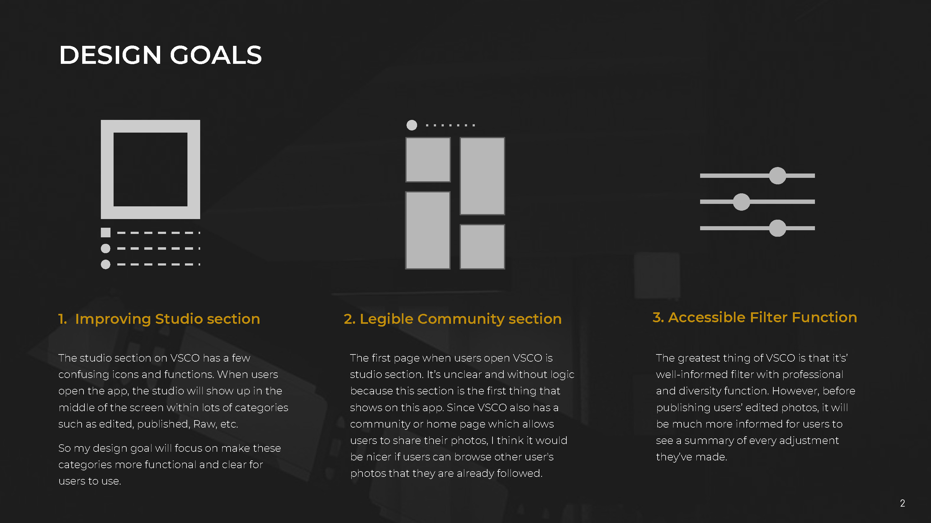
VSCO is a well-known photography app that provides users a broad editbility to their photo. As an active user of VSCO, there are a few pain points among the app. In order to make VSCO into a more intuitive app, there are three design goals to pinpoint the pain points of user experience.
1. Improving the Studio Section
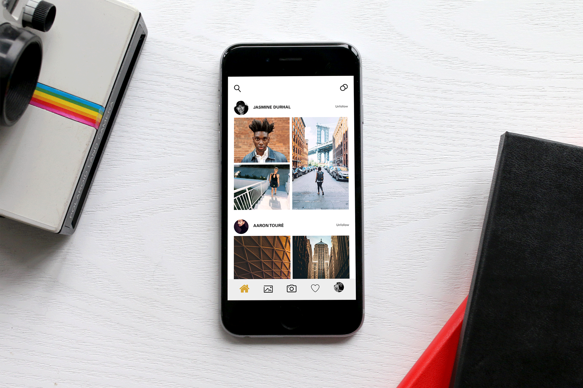
2. Legible Community Section
3. Accessible Filter Function
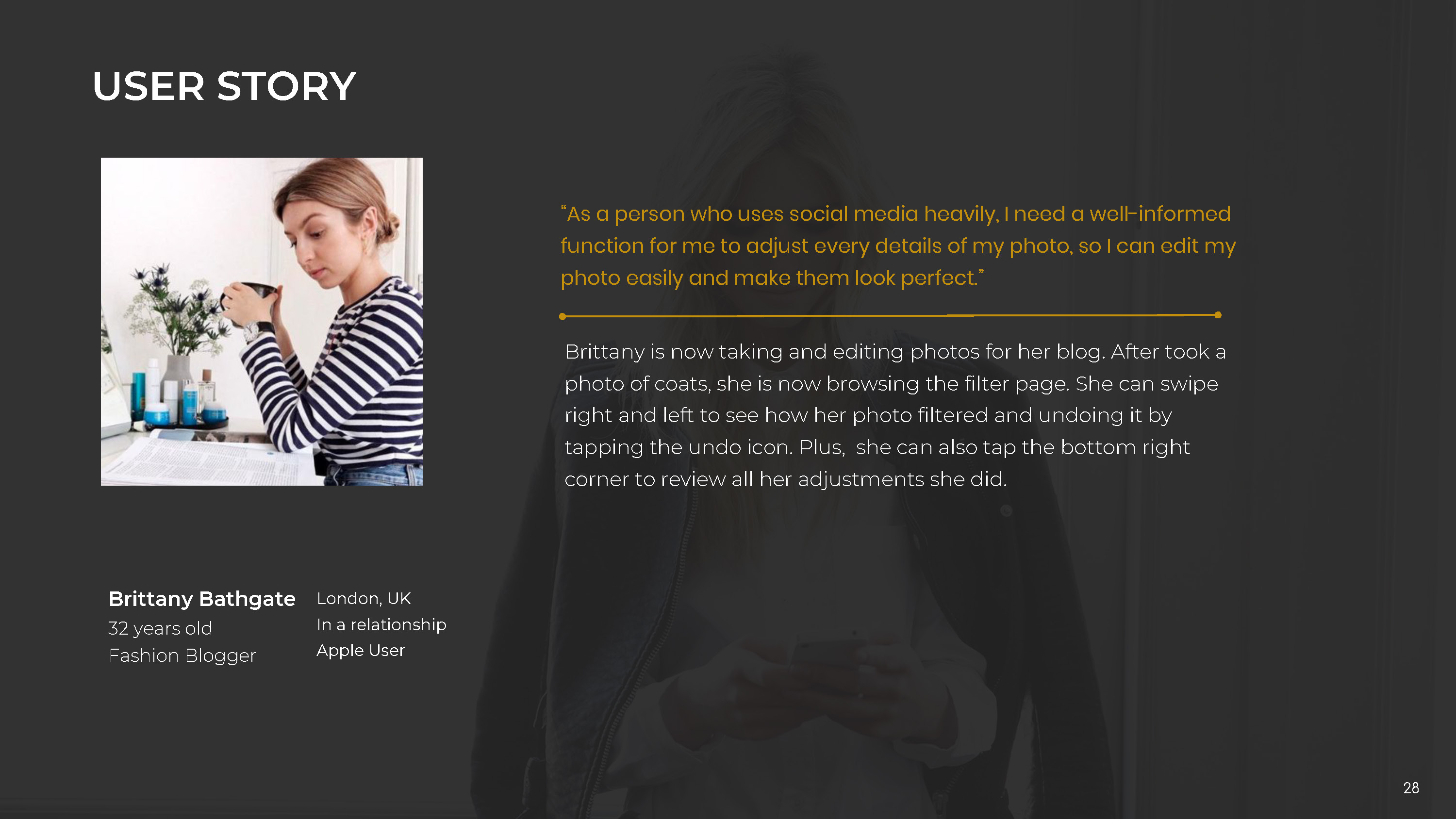
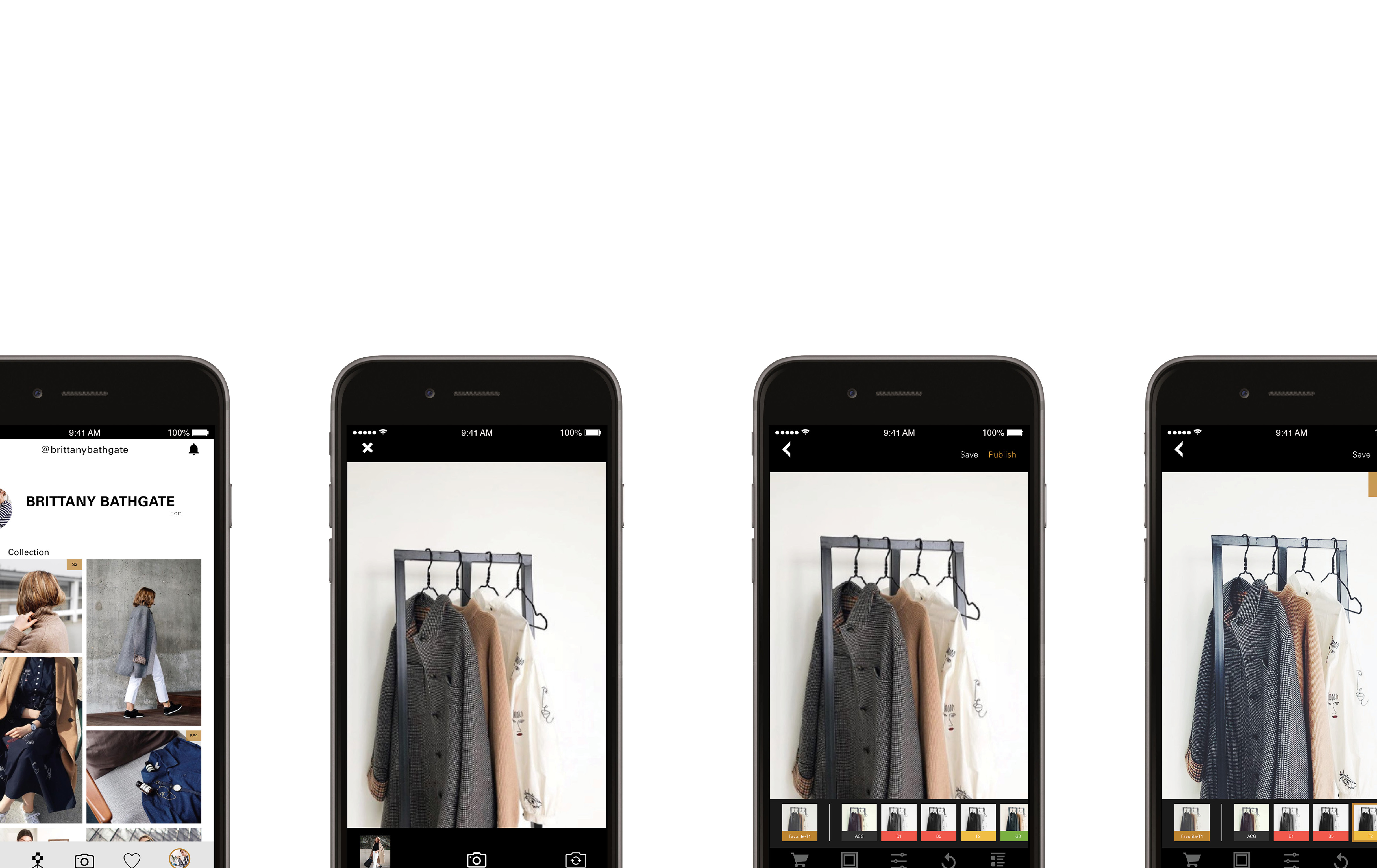
As the user experience evolves, I outlined three personas to capture the user behavior. I’ve also redesigned the interface of VSCO. To increase the app’s clarity, a set of new icons are assigned across the user interface to increase the legibility of this app.
對於攝影感興趣的人一定對於vsco不陌生,VSCO是一個提供給用戶豐富濾鏡庫和修圖能力的應用程式。身為VSCO的用戶,在使用的途中遇到了幾個paint points(痛點) 引起了我對VSCO重新設計的想法,希望把痛點轉成賣點。
在設計之前整合出了三大重新設計的要點:
1. 改進stuido的功能
2.提高主頁的能見度
3.簡單明瞭的濾鏡功能。
設計的過程也針對了這三大要點描繪出了三位人設(persona)去精準的達到這次重新設計目標。