p.n.g.
Intro
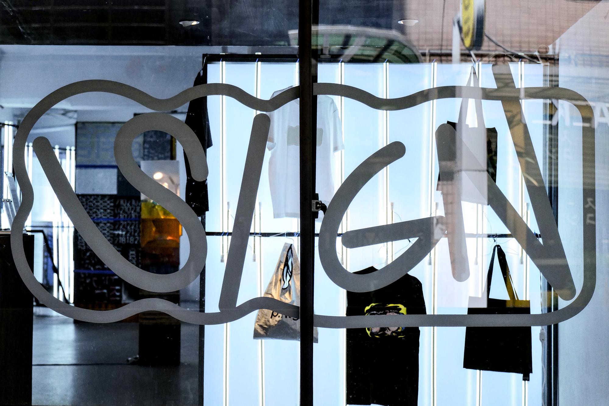
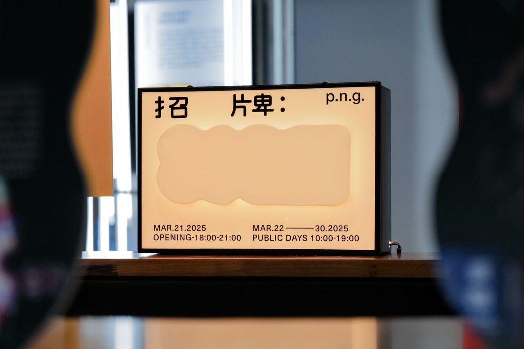
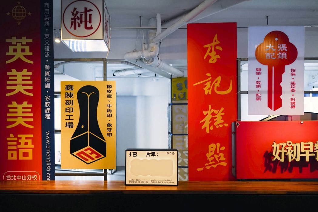
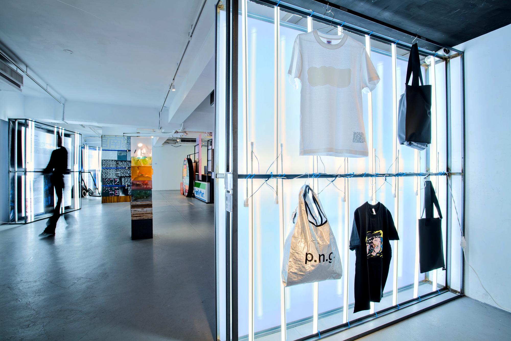
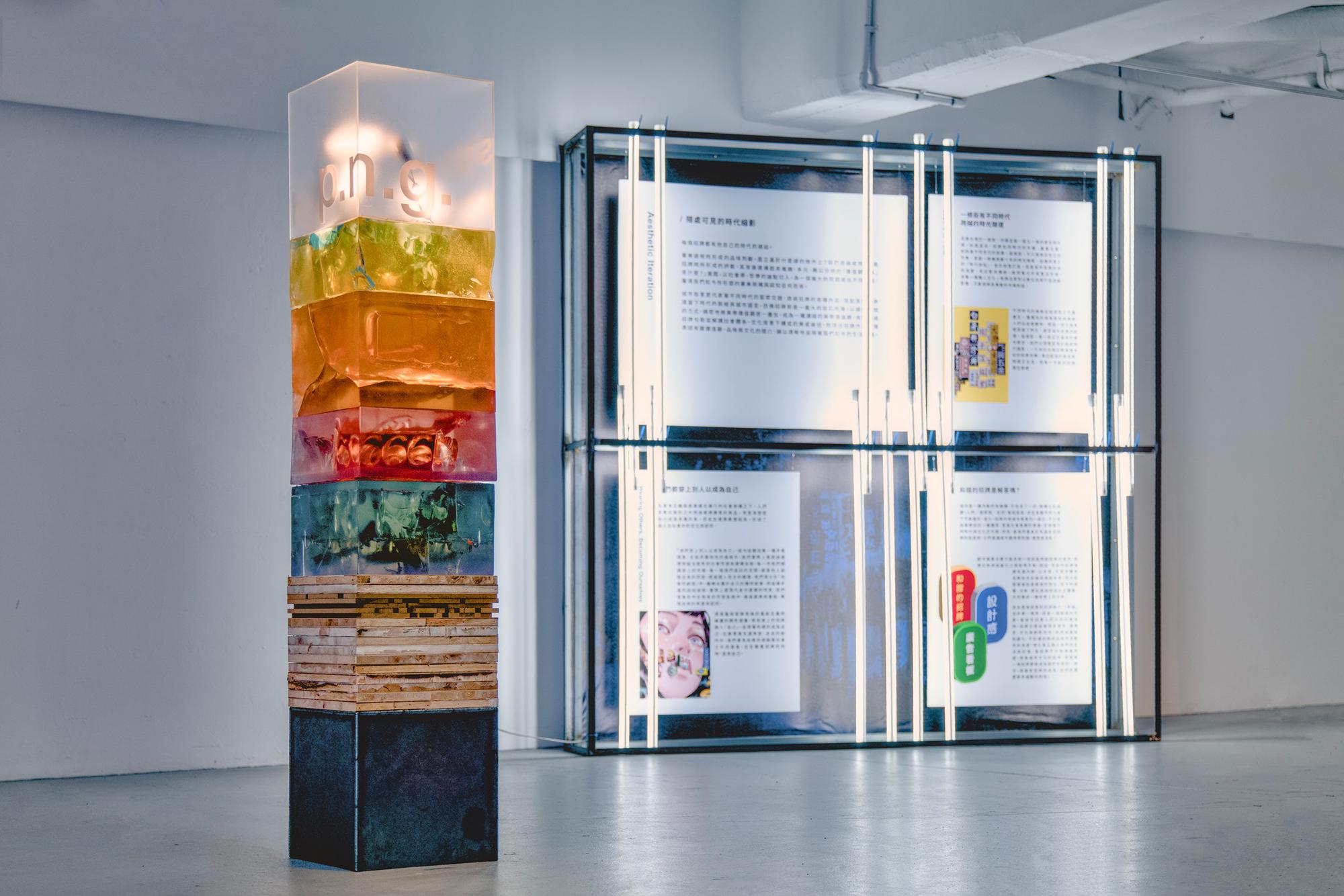
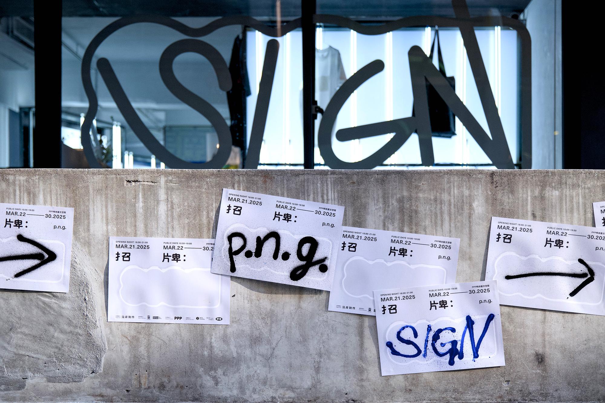
What is a signboard? The question that opens the exhibition sounds almost too simple to ask. What is a signboard? The answer is where things get complicated, and that gap between the obvious question and the layered answer became the engine behind the entire identity system. SIGN reframes the signboard as a cultural object, pulling it away from pure utility and asking what it actually does in the world. As p.n.g.'s inaugural curatorial theme, the exhibition treats it as both a singular marker and a generational artifact: something that announces individual identity while quietly accumulating collective meaning over decades. Hung above a doorway or bolted to a storefront, a signboard is never just information. It is a declaration of existence, a set of choices about color, form, language, and legibility that reflects back the values, aesthetics, and desires of whoever made it. The identity builds from that premise. An abstract shape coexists with the word SIGN throughout the visual system, not as decoration but as a deliberate provocation. It gives audiences something to sit with before they enter, a form that hints at what is inside without explaining it. The shape carries the same ambiguity the exhibition asks visitors to bring to every object on display: familiar enough to feel recognizable, open enough to resist a single reading. Surface and signal become inseparable from the first moment of contact with the brand. That tension carries into the spatial design. The exhibition unfolds through four curatorial lenses: Promotional, Narrative, Guidance, and Aesthetic Iteration, tracing the signboard's evolution as a vehicle for human desire, communication, and cultural value. But the organizing logic underneath all four is the same. A signboard is a self-portrait made public. Every choice embedded in one, the typeface, the color temperature, the material, the scale, is a reflection of who made it and what they needed the world to see. Cruising through the streets of Taiwan makes this immediate. The signboards that line those streets are not a backdrop. They are a record: of family businesses, of neighborhood identities, of aesthetic eras, of what people chose to put forward when they had one surface and one chance to speak. SIGN takes that record seriously, treating the street as an archive and the signboard as its primary document. At its core, the exhibition is an act of self-exploration disguised as cultural observation. You are not just reading the signs. You are recognizing something in them. Recognized by|London Design Award 2025-Silver Winner, Muse Award 2025-Silver Winner, Golden Pin Award Organizer | Atelier YenAn Curators | YenAn Chen, Powei Chang Exhibition Director | Shu Yuan Chang Project Manager | Zo Lin Lead Designer | Fairy Shih Exhibition Design Support | Raku Lee Exhibition Production Assistant | Man Rong Chang Photography | JunSiang Yang Spatial Design | 3/3 TRIO DESIGN Exhibition Production Support | YiChiao Lee Exhibition Partner | BaoYi, 3/3 TRIO DESIGN Venue Partner | PPP Gallery
Deliverables:
Website Design
Logo Design
Art Direction
Branding
Brand Strategy
Product Design
Motion Design
AI Solution Integration